News
Search Options ►Lasius
Site Update
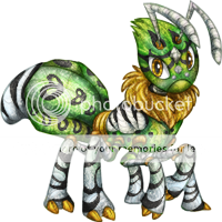
The previous Lasius was won by Justarius (#48993).
To win this Lasius, write a tip about making a nice Aywas design in the comments of the news post. Even if you aren't an artist, you still know what constitutes as nice to you, so write about it!
Ends in 24 hours.
Posted by JAK
(#15) on Sat Apr 5, 2014 5:46pm
- Fuzzball
(#34146)
-
Posted on: Sat Apr 5, 2014 6:17pm
Its always best to clip individual sections and use complementary colors :)
- Ammika
(#58099)

-
Posted on: Sat Apr 5, 2014 6:17pm
Never go overboard while you're still learning; if you suck at textures, trying to put four on one pet isn't going to teach you anything! Just practice little by little without overpowering yourself and hurting your self-confidence.
- Shikaru
(#51507)

-
Posted on: Sat Apr 5, 2014 6:18pm
Make sure the colors compliment each other nicely, and avoid pure white/black.
- Namine + Marluxia
(#702)

-
Posted on: Sat Apr 5, 2014 6:19pm
A nice design is whatever the artist is comfortable with! Sure there are some guidelines to how pets here should be submitted, but if you're comfortable and you are proud of your art, then that's a good design and yay for you! :D
- =RDF= Kerine
(#28732)

-
Posted on: Sat Apr 5, 2014 6:20pm
Have at least some idea of what you want to do with the design, but don't be too stuck on the concept to move away from it and experiment with other things that might look better. Also, Always color the lineart and shading, even if you've been working on the design for hours and just want to be done. It always looks better, and sometimes you even have to color the highlights (like on the turtle SCC in many cases). Don't make the lineart too much darker than the colors though (it just looks black if it is or still odd), and sometimes you'll have to put different colors on the lineart for one object (clipping more layers to the lineart really helps with this). Don't just color with flat colors, always try for at least some markings. If you aren't great at making markings look good, working at 400x400 or even 800x800 makes slight errors in markings far less noticeable, and looking at the kinds of markings your favorite artists do is good for helping you come up with your own (don't copy theirs, though!). Finally, after I've finished coloring something, I always like to set it aside for a while before actually doing anything with it, just to look at it with fresh eyes. If something about the design was troubling you, it's much easier to see what after a break from coloring, and even if not, you can still notice things you aren't satisfied with and have a better picture on your design.
...Wow, that's a lot of stuff I just wrote.
- Stickydot
(#41296)

-
Posted on: Sat Apr 5, 2014 6:21pm
Sketching is very helpful with coming up with a design, but don't be afraid to add more things in later. Also, color your shading layers, it helps the design pop a bit, and keeps it from looking lifeless.
- Tea.Time [Soulwings]
(#2995)
-
Posted on: Sat Apr 5, 2014 6:21pm
Be sure to mark all your layers with a name so that other users and breeders know what the layer is for and why it is there. Also be sure to remove unneeded layers from your psd's to avoid confusion.
~soulwings
- Kalid [hiatus]
(#49104)

-
Posted on: Sat Apr 5, 2014 6:22pm
Details do matter- and intricate designs can really really make a pet stand out. But beware the curse of minimization. What I mean, is when drawing, you are seeing a very up-close version of the design. Keep in mind that the version you are seeing while drawing will be one fourth of that size or less! Zoom out from time to time to make sure that what you really want to stand out, stands out, and that the markings don't get mashed together visually when minimized.
- Tomatoraptor
(#42034)

-
Posted on: Sat Apr 5, 2014 6:23pm
Complementary colors look wonderful on pets! Also, use light and dark colors together; contrast is eye-catching.
And ALWAYS check for loose pixels! Use different colors behind the pet to get the best results.
Posted on: Sat Apr 5, 2014 6:17pm
Don't use to many edits that would clash together and use a good color palette.