News
Search Options ►Lasius
Site Update
The previous Lasius was won by Justarius (#48993).
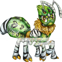
To win this Lasius, write a tip about making a nice Aywas design in the comments of the news post. Even if you aren't an artist, you still know what constitutes as nice to you, so write about it!
Ends in 24 hours.
Posted by JAK
(#15) on Sat Apr 5, 2014 5:46pm
- Kirema
(#264)

-
Posted on: Sat Apr 5, 2014 5:56pm
Layers and Folders and LABELS! At least for photoshop users.. I just love having organized folders for my PSDs. If there's not folders in a design, I tend to make them if I ever need to dig into the PSD for any reason. Layer labels! Gimp, photoshop, sai.. what have you. Give the layers a name! Shadows, highlights, dot marking, strip marking, gradient, lineart.. just something XD
- 💖Tooki 💀
(#42928)

-
Posted on: Sat Apr 5, 2014 5:56pm
Make sure you are enjoying yourself and having fun, everything else is added bonus
- Captain- -
(#13852)

-
Posted on: Sat Apr 5, 2014 5:57pm
First off, know your idea before hand. If you have something in mind then go for it, if you don't look around for color schemes and see what colors fit well together. Secondly, take your time. Don't rush just to get it done. (i'm bad about doing that myself) if you don't have time to and rush it , you might not get the result you ultimately wanted in the end. Third: LOCK your layers, if you don't then going outside them might result in your custom being denied. fourth: shade the custom in a darker shade than what you colored the base. and finally make sure it's not to dark or to light.ask for advice, post it for others advice and in the end of it all have fun
- FernisWolff
(#40519)
-
Posted on: Sat Apr 5, 2014 5:57pm
Hm... I find that color details and designs are what make a lovely creation. Oh.. and lines. Nice sharp lines. .-. Im terrible at making those and seem to have a bad shakey hand.
- Hoborat
(#373)

-
Posted on: Sat Apr 5, 2014 5:58pm
Texture. Balance the texture. Super detailed is cool however it's not needed on such a small canvas. Sometimes less really is more.
- Zaria
(#14800)

-
Posted on: Sat Apr 5, 2014 5:58pm
If your adding edits don't make the lineart too heavy. Try to keep it about the same as the original. But don't be afraid to make the lineart heavier if it is actually needed to portray the true depth of the image.
- jackiefrost
(#57921)

-
Posted on: Sat Apr 5, 2014 5:58pm
don't make the hair without lighting when the rest of the design has lighting
- singingbadgerLLovesU
(#30385)

-
Posted on: Sat Apr 5, 2014 5:58pm
Go through the PSD completely BEFORE you do anything. Look it over one layer at a time, and name the layers if you need to (and blank them briefly to see how they influence the overall design. If the base is large or complex, make duplicatesfor overlay and erase selective areas to make coloring easier - this adds a great deal of depth and detail without needing tons of art skillz.
- MissMally
(#473)

-
Posted on: Sat Apr 5, 2014 5:59pm
Texture can really make a difference in a design! Choose a textured brush, (a default photoshop one or a downloaded one) reduce the flow to 5-10%, and lightly brush over the design, following the shape of the pet. (setting it to multiply can help this too) IT really makes the design appear less flat, and can add a lot of depth above or beneath your markings.
Posted on: Sat Apr 5, 2014 5:56pm
mix and match or try different designs