News
Search Options ►Lasius
Site Update
The previous Lasius was won by Justarius (#48993).
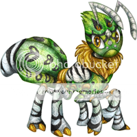
To win this Lasius, write a tip about making a nice Aywas design in the comments of the news post. Even if you aren't an artist, you still know what constitutes as nice to you, so write about it!
Ends in 24 hours.
Posted by JAK
(#15) on Sat Apr 5, 2014 5:46pm
- Nebula
(#39317)

-
Posted on: Sun Apr 6, 2014 12:39pm
Color palette. Some pets may have the most beautiful designs but if you don't choose the right colors; it may be catastrophic. Make sure that before you color a pet, you think of what you want to do with it. Be inspired, go on websites, look at pictures, watch movies. Everything is in the color palette, have fun!
- TK!
(#623)

-
Posted on: Sun Apr 6, 2014 12:58pm
Gradiation! Add multiple different "gradiant" layers to markings, especially if it's a simple base marking. Instead of black on white, try adding some grey in between! You could do this with the same color on a lower opacity. C:
- Imajn
(#91)

-
Posted on: Sun Apr 6, 2014 1:26pm
A nice method of noticing errors in your drawings is to flip it over horizontally :)
- Hobbit
(#17104)

-
Posted on: Sun Apr 6, 2014 2:11pm
Use of colour is to me what separates a good piece from a great piece.
- Tee Hi <3
(#39846)

-
Posted on: Sun Apr 6, 2014 2:31pm
Tip: $5...
Oh, wait, for making a Custom? Uuuuuhhh...
I personally like it when the lines are light, like white or grey and the coloration is a darker color - or blue, which is my fave color - as it gives the Pet a cool, neon-ish look. Bonus points if the eyes have some kind of glow to them, too! :D
- Starye
(#23716)

-
Posted on: Sun Apr 6, 2014 3:28pm
Pay attention to the colors you use. Sometimes opposing or similar colors are okay but sometimes they stand out too much and make the design not focused on the pet but on a specific part of it due to looking awkward.
- Pyromania
(#33715)
-
Posted on: Sun Apr 6, 2014 3:44pm
When designing something, give it as much detail as possible WITHOUT making it cluttered. If something's too jumbled and/or full, it won't look visually appealing and will end up just looking like a huge mess. This also goes for colour combinations; don't mix together colours that go awful with each other or are too similar to the point where you can barely distinguish between them.
- Kazna (Pirate@142)
(#233)
-
Posted on: Sun Apr 6, 2014 3:49pm
Separate your edits, don't just add a new layer of lineart and edit the base colouring on the same layer to fit. It makes things really hard to breed, and it doesn't even take that much more effort to click new layer occasionally.
- Copy X
(#55222)

-
Posted on: Sun Apr 6, 2014 4:29pm
When making edits or coloring, make sure they're on the right layer. @~@
Posted on: Sun Apr 6, 2014 12:36pm
When making edits, mask instead of edit so that it'll be easier to breed in the future. xD