News
Search Options ►Insi Redraw
Pets
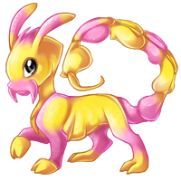
NEW LINEART

OLD LINEART
Feel free to post comments on this news post too.
Posted by Jack
(#1) on Fri Mar 26, 2010 1:36pm
- gl.tch
(#4144)

-
Posted on: Wed Dec 31, 1969 6:00pm
As someone who idly makes their own colourations, I have to point out that the reason the old Insi was a 'challenge' to colour was because it's a physical impossibility. Even simply in terms of perspective and believability-of-pose, the new Insi should be chosen, regardless of whether it's as 'cute' or whatever - at least the darn thing could physically exist!
xD
- Centehua
(#4273)

-
Posted on: Wed Dec 31, 1969 6:00pm
i like the new lineart, looks more insect-like and more realistic :D
- Chichi
(#3573)

-
Posted on: Wed Dec 31, 1969 6:00pm
But the glint in his eye would be in a different position if he wasn't looking at you.
- Leahana~
(#4112)

-
Posted on: Wed Dec 31, 1969 6:00pm
The old one makes me think it's going to attack me. Like it's angry. The new one has more of a docile, "Look at me I'm so pretty" kind of pose. As for the long leg, to me it seemed more like the back leg was just being stretched some, part of the pose.
- Chichi
(#3573)
-
Posted on: Wed Dec 31, 1969 6:00pm
"classy and sophisticated"-- Um, Sors, Vion? Pretty classy/sophisticated looking to me :9
- Chichi
(#3573)
-
Posted on: Wed Dec 31, 1969 6:00pm
OH lol I didn't realize that you were talking about the new one. But really, the new pets are classy/sophisticated looking to me.
- Sven
(#1234)

-
Posted on: Wed Dec 31, 1969 6:00pm
I just don't think it looks like an insect. :c
- WyrGecko
(#568)

-
Posted on: Wed Dec 31, 1969 6:00pm
Overall, I like the new one more in terms of form, but the front of the head area seems like it could use more definition (esp. mouth/forehead area).
- Bane+Sii+Sora
(#1622)

-
Posted on: Wed Dec 31, 1969 6:00pm
The eye glint just tells you where the light source is, not where it's looking. You can't use that to judge eye direction, because it shows in the same place no matter where the eye is looking so long as the light source stays in the same relative position.
Posted on: Wed Dec 31, 1969 6:00pm
Eh, I overlooked the weird line in the middle. Not too big a deal with me, though I'd like to see it shaded more into two different segments to clarify what it is X3.
The lines and colours themselves are an obvious improvement from the old one, its just the few little bits I picked up on right away that are bugging (ha, bugging X3) me. With the minimal shading faults (As I said with the neck and the tail, one section in particular on the tail too) they can be fixed.
Eh, gives me an excuse to finally think about turning my explorer into something other than a Jumping Spider X3. Been wanting to change her for a while now.