News
Search Options ►Welcome to December - Part 2
Site Update
I swapped around the entries from the GP and BP threads. You get the highest prize possible (EG: If you submitted for GP and got into the BP Shop, or if you submitted for BP and got into the GP Shop).
I have a couple pets saved from the thread also that I want to use in the forest, so a couple others are in limbo until then. :)
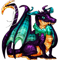
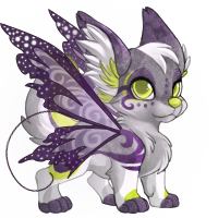
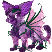
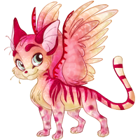
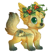
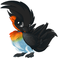
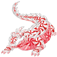
GP Shop Pets!


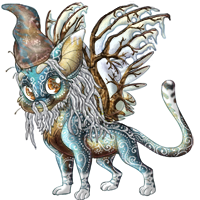
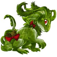
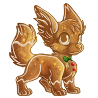
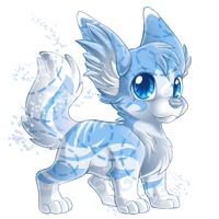
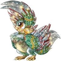
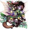
BP Shop Pets!

Monthly Potion and Premium Item!


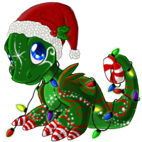
The December 2010 potion is hanging out in the BP Shop for 400k, and the monthly premium item is a Basic Stocking. :)
Other Stuff
Trophies have been awarded, after a bit of a chaotic experience last night. XD I don't have much else to say, except what do you think of Yasu's new Nav idea?
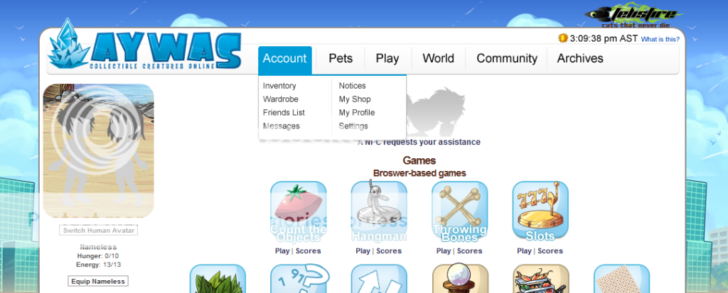
Would you prefer a nav like this? If you've noticed we're slowly running out of room in some of our sections (Archives and Shopping for example) so this would fix that problem :)
Posted by Jack
(#1) on Thu Dec 2, 2010 12:37am
- bananas
(#8442)

-
Posted on: Thu Dec 2, 2010 1:14am
Awesome! My elf soli made it in the GP shop! I'm totally stoked right now x3 Tbh, I like the navigation we have now xD But if changing it will give aywas more room to build then I say change it :3
- (Moved to #111)
(#293)
-
Posted on: Thu Dec 2, 2010 1:17am
If it's absolutely neccessary, is there any possible way to perhaps implement that nav whilst keeping a similar look of the current one? I have to admit that I find the look of that banner/nav kind of boring/plain compared to the one we have. And what Krysteenah said would work, if you have to click on it before it'll pop up, and perhaps if you have to click again or click elsewhere for the navigation to disappear (so you can't run your mouse off by accident). I think I'd like it/not be bothered in that case.
- null
(#543)

-
Posted on: Thu Dec 2, 2010 1:30am
Drop down menus are evil, their removal was one of the things I really liked about V3. xP
- Kassquatch
(#1288)

-
Posted on: Thu Dec 2, 2010 1:33am
I actually prefer the nav we have now, lol.
- Empty
(#1364)

-
Posted on: Thu Dec 2, 2010 1:35am
Drop down menus please!
- Caroline
(#100)

-
Posted on: Thu Dec 2, 2010 1:44am
I really like that nav :D
In that nav the links are much more organised and easier to find (since they are lined up underneath each other and with lots of space)
I don't really like the current menu :c It's hard to find the link you're looking for and I dislike unnecessary clicking. So the idea to add more levels in the current nav instead doesn't appeal to me at all.
- Kris ♥ Juney
(#351)

-
Posted on: Thu Dec 2, 2010 2:02am
I like the current nav better as well. It's really the two rows of links that kill it for me - I think that makes it look clunky and difficult to use. Would it be possible to switch/sublink some of the links on our current nav?
(i.e. Friend List under under 'Account', Wardrobe when you click your HA, Gifts and Trades together, Fauna Safari and Battles together, Auctions under one large link with the different types split up on a separate page, same for the various Tutorials...)
- Larkspurr
(#2787)

-
Posted on: Thu Dec 2, 2010 2:03am
I like that menu a lot. I would like it.
- Lunch & Obi
(#2021)

-
Posted on: Thu Dec 2, 2010 2:29am
Love the Nav(Yes, it would be easier to use) and those pets are gorgeous. I wish I could get them all. Good job, staff. :)
Posted on: Thu Dec 2, 2010 1:12am
I like the screenie :D It makes the tab more neater ;)